How to Display Dynamic Sidebars and Widgets to Reduce Bounce Rate
- Category : WordPress
- Posted on : Feb 17, 2019
- Views : 2,940
- By : Yakov R.

Today we’ll be diving into the topic of dynamic sidebars and widgets (those that are content-relevant); more importantly how they can help reduce your site’s bounce rate and in turn improve your chances for a conversion. We’ll show you how to create a sidebar, along with widgets that show your visitors exactly what they want to see based on the topic or content of the current page or post.
What Is Bounce Rate?
Before I show you how to reduce bounce rate by displaying content-relevant sidebars and widgets, let’s first define bounce rate.
Bounce rate refers to the percentage of site visitors who enter and leave rather than staying to explore other pages on your website. To reduce bounce rate you need to increase engagement, and this tells you much about your site’s usability. When a visitor finds your content useful, they stay and are willing to explore the site for even more useful content. This, in turn, gives you a higher conversion rate. The longer your visitors stay on your site, the greater the likelihood for more sales, sign-ups, and ad revenue.
Of course, you want them to stay longer, so you must have something that will stop them from leaving too soon — useful content.
Usability: The Key to Reducing Bounce Rate
You don’t achieve site usability by only providing useful content to your site visitors. You also have to optimize the tools you display on each and every page in such a way that they interact with them. Moreover, these tools should also be relevant to the content that’s being used on a certain page.
The tools I’m referring to are the navigation bar and all the widgetized areas in a given page, including the sidebar. While to many, the navigation bar plays the biggest role in ensuring user engagement, you cannot take for granted the power of your widget areas. This is especially true when you’re aware of the many different ways WordPress provides for you to easily take control of them.
The sidebar is the primary widget placeholder that can either make or break your website’s usability. Why? — Because it’s convenient to just put whatever widgets you like in the sidebar without thinking whether or not such widgets are relevant to the main content.
What Are WordPress Dynamic (Content-Relevant) Sidebars?
A WordPress sidebar that is relevant to the main content refers to one that displays widgets carefully chosen to appear next to specific content on a given page in terms of their applicability. For example, a sidebar relevant to a specific blog post would contain widgets such as newsletter opt-ins and related posts.
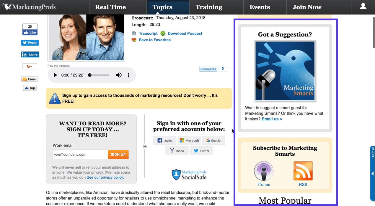
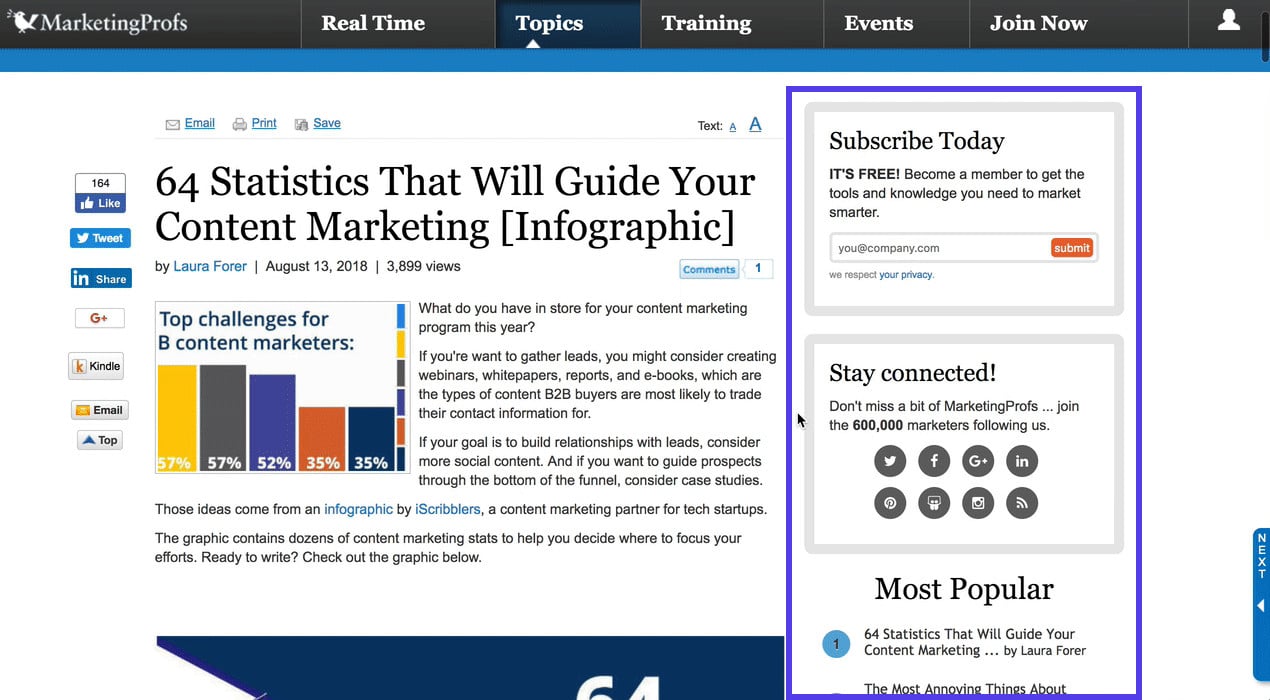
The screenshots below show the difference between the sidebar on MarketingProfs.com.
Podcast Page (Screenshot A)
On this blog article, MarketingProfs is showing the following widgets: suggestions, subscription links, and most popular posts.
Article page (Screenshot B)
On this blog article, MarketingProfs is showing the following widgets: subscription opt-in, social media widgets, most popular posts.
How Dynamic Sidebars Help to Reduce Bounce Rate
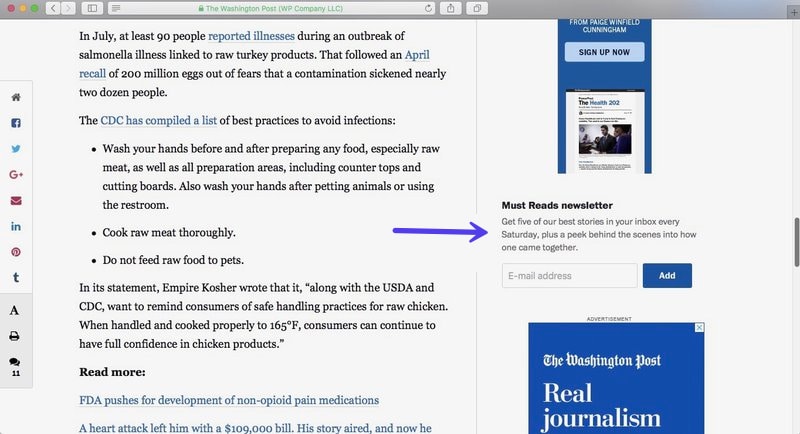
Sidebars help site visitors decide which action to take next. For instance, from a blog post page, they can opt to sign-up for newsletter subscription. If you have a number of categories for newsletters, you can display a subscription widget for the category where the blog post belongs. Each widget bears the name of the specific category, so readers know exactly what they are subscribing to. Look at the images below taken from The Washington Post.
Content-relevant sidebars also aid in targeted marketing. You can create a sidebar dedicated to site users you group based on demographic information. For example, you can make sidebars for your website’s varying language versions, display in them contact links depending on location, or show product promotions based on their interests. Or you create different sidebars based on the category of your blog posts.
The Washington Post has “Must Reads” as one of its categories for newsletters. The widget appears in this article entitled “Salmonella-tainted chicken killed 1, sickened 17 in a multi-state outbreak, CDC says” and all the other articles belonging to the same category.
On the other hand, this Tech article, “Facebook and Twitter executives to testify to Congress next week”, from The Washington Post has the widget “Tech news email alerts” displayed in the sidebar, targeting readers of tech-related stories.

Sidebars with widgets relevant to the content can also help improve SEO. Using the whole heading tags or a portion of it as widget titles can create a small but meaningful impact on search engine optimization.
Adding Relevant Widgets to the Sidebar
The first step to creating content-relevant sidebars is to decide what’s relevant and what’s not. Deciding which widgets to appear on a page or post requires an in-depth understanding of the purpose and why you created that page or post in the first place.
For instance, you created a product page not only to explain the product’s features, benefits, and pricing. You also did so to lead the visitors into purchasing it or into considering similar or related products. In addition, you may want to show off the product’s highest ratings and best reviews that can help them decide to buy it. Or, you may want to help them connect to a sales representative to answer questions. Whatever action they take, the page must show them the way to do so. The sidebar is one of the best places to put those call-to-action buttons. Hence, the sidebar becomes a very powerful tool in keeping your visitors engaged in your website.
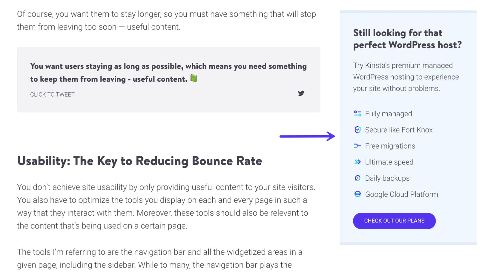
Host SEO, for example, uses different CTAs on their blog based on the category of the blog post. This helps ensure the messaging is targeted and relevant to the topic of the article.
Weeding Out Unrelated Widgets
Furthermore, deciding what not to put in the sidebar is as important as deciding what to put there. The density of the sidebar and other widget areas on the page contributes to its overall look and feel. Weeding out irrelevant or redundant widgets addresses the same issue with bounce rates. In fact, some sites may find that no sidebar at all is a better way to go.
Perhaps you threw a bunch of widgets into your sidebar because you think they might be useful for your visitors. However, an overcrowded looking page may turn off a potential customer. If there’s too much happening on the page, visitors might lose focus on what made them come in the first place. By this, I mean too many external ad widgets or too many product links.
Simply put, deciding which sidebar content is relevant or not is critical for increasing user engagement.
Highlighting Important Widgets
After deciding what to put in the sidebar, you can make certain widgets standout from the rest. One way is to make them appear in other widget areas, such as the footer. Another way is by making them fixed and floating over the page as users scroll. This allows users to instantly interact with them without having to scroll back up or down.
Next Step: Choose the Best Methods
Now that we’ve discussed the importance of which widgets you use, the next step is to choose a method of creating those content-relevant sidebars. Here are 2 ways:
Option 1 – Control Widgets Visibility with a WordPress plugin
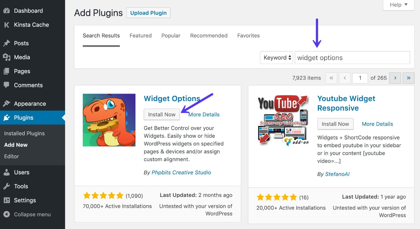
One of the easiest ways to control widget visibility on your sidebar is by using a WordPress plugin. A plugin like Widget Options lets you do just that with a few simple clicks. You can show or hide sidebar contents per post or page with conditions including categories, tags, page names, etc.

The Widget Options plugin currently has over 70,000 active installs with an impressive 5 out of 5-star rating. You can download it from the WordPress repository or search for “widget options” within your WordPress dashboard under “Plugins → Add New.” Then click on “Install Now” and activate the plugin.
Hiding Widgets From a Specific Page
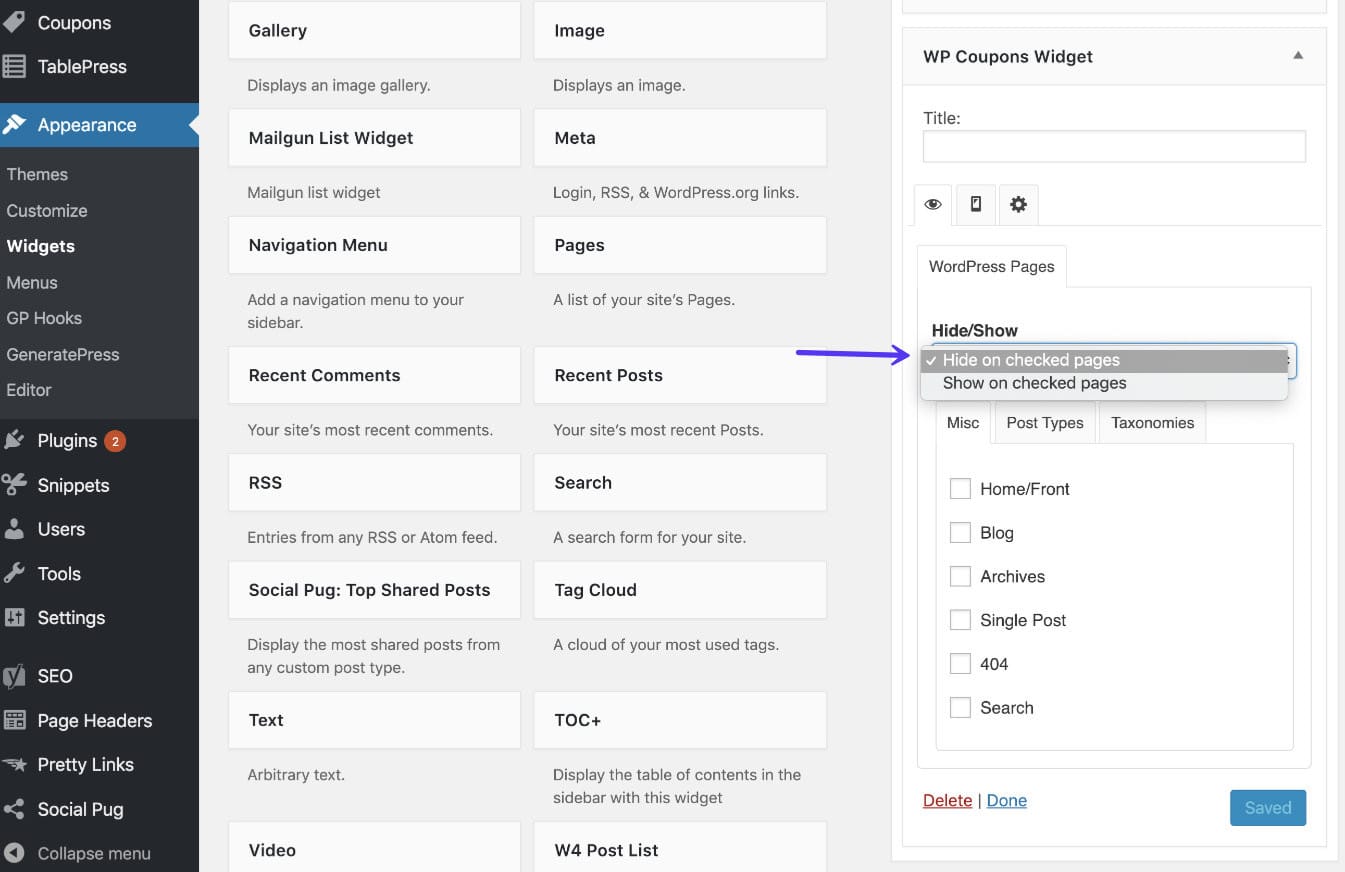
Once you have the Widget Options plugin installed and activated, you can easily hide a widget from a specific page in just a few clicks. To illustrate, here’s the screenshot of a coupon widget. Under the settings of the widget, there is now a visibility option: you can choose between hiding and showing this widget on selected pages.
Restricting Widgets From Specific Posts
You can also hide widgets from blog posts by using conditional tags. Using Widget Options, this process requires a couple more steps than simply hiding from pages. You need to first locate the post ID, as will need to include in the conditional tags where you want to hide the post.
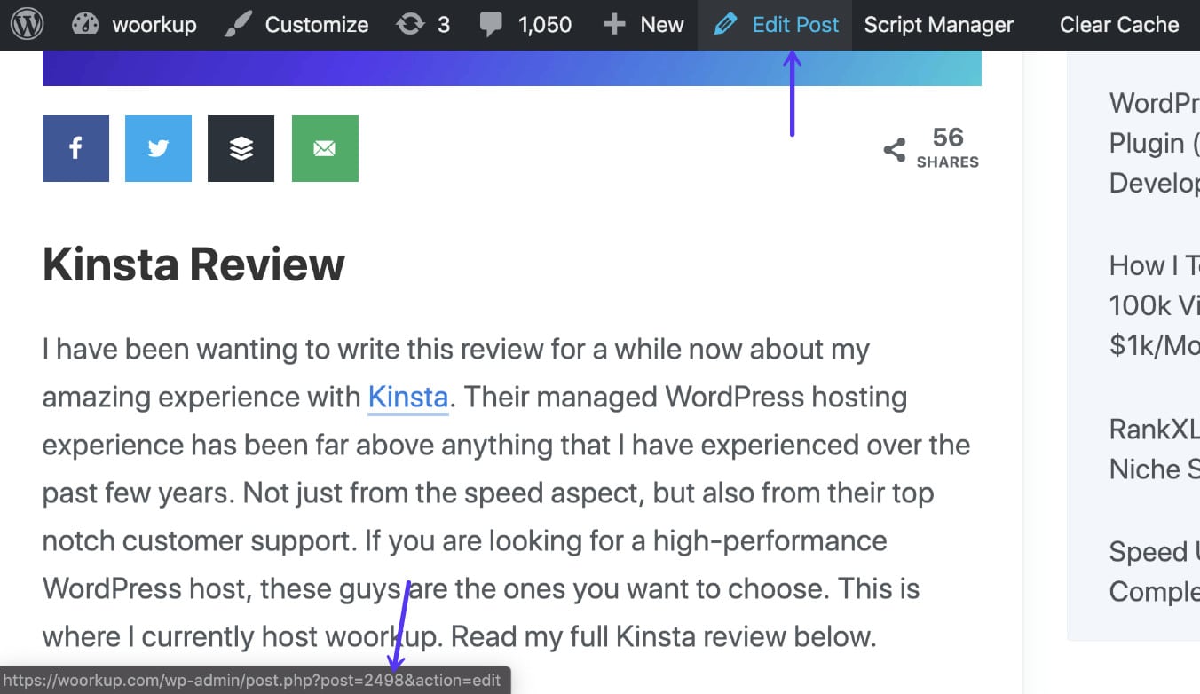
To find the post ID, browse to the post and hover (don’t click) over the “Edit Post” option in your WordPress admin toolbar. In the bottom left of your browser you should see the post ID #.
Once you have the post ID(s), you can use it with the following conditional tags.
Hide a Widget From Multiple Posts:
!is_single(array('Post ID', 'Post ID'))Hide a Widget From a Single Post:
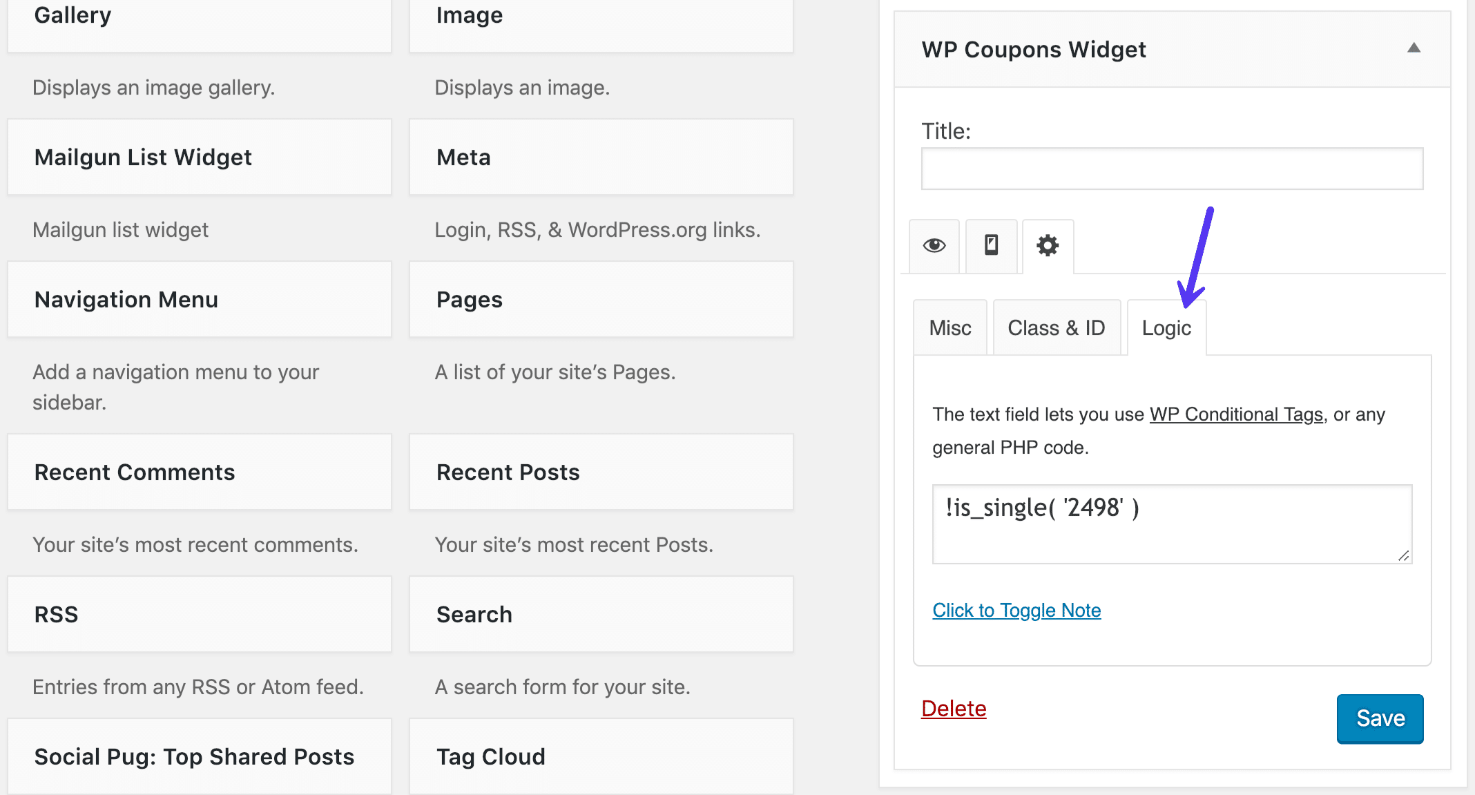
!is_single( 'Post ID' )On the widget you want to be hidden from the post, go to the “Logic” tab and input the tag as shown below.
In addition, should you need to use a widget title relevant to a page’s or post’s heading tags, you can place as many copies of that widget as needed and make a unique title for each.
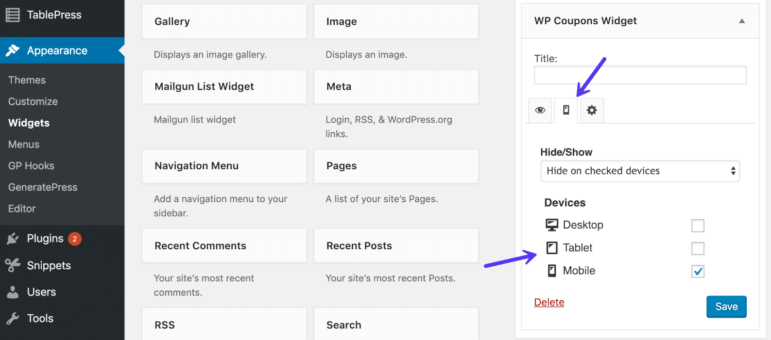
Hide Widgets From Mobile Devices
You can also restrict widgets visibility when a page or post is viewed on specific device types.
Due to limited screen size, it’s easy to make a page or post look crowded when viewed from a mobile device, such as a smartphone or tablet. We want to make sure that every page does not look too dense both on a desktop and mobile view. However, we also want to take advantage of the bigger desktop screen for displaying relevant widgets in as many widget areas as possible.
For example, we want the e-mail opt-in to appear both in the sidebar and in the footer. When viewed on mobile, on the other hand, we want to get rid of repetitive widgets. Widget Options allows you to hide widgets on mobile view.
Make Sidebar Widgets Fixed
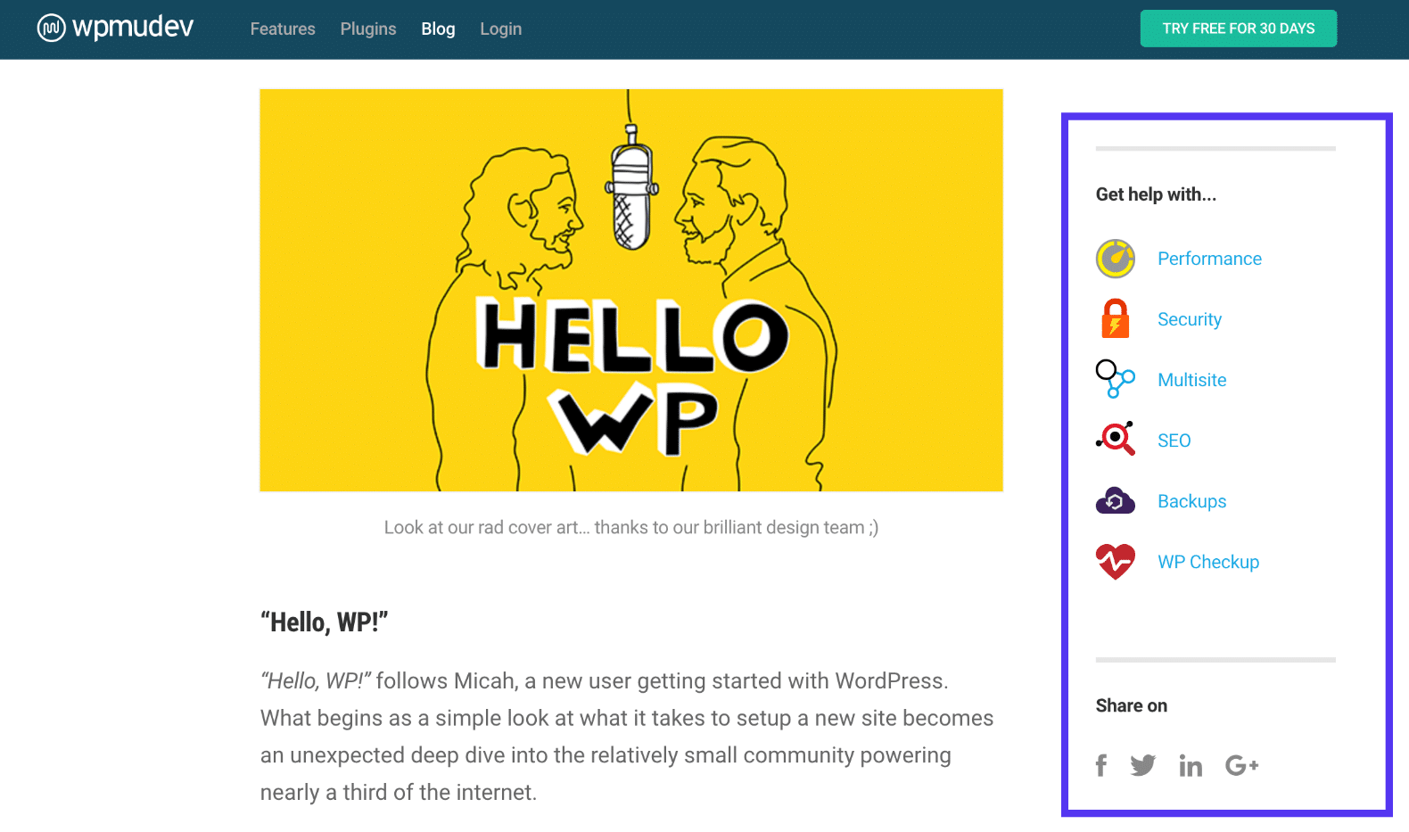
Another way to control widgets visibility is to make them fixed, which means they will follow the users as the scroll up and down on a page or blog post. If you keep your sidebar clean, or only apply this to one or two widgets, you shouldn’t have to worry about this becoming too obtrusive. Look at the screenshot below. WPMU Dev has a great application of this on their blog.
The social share widgets are floating over the page without overshadowing the main content and encourage visitors to take action whenever they are ready to do so. This means they don’t have to scroll back up to the sidebar area to interact with these widgets.
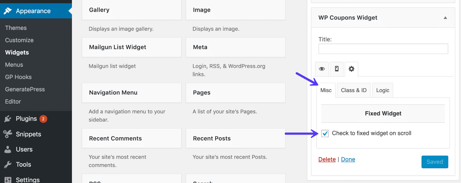
Widget Options provides an option wherein you can make any widget fixed and follow visitors as they scroll. You can choose to make all the sidebar widgets fixed or just pick one or two that you think need more exposure than the rest.
Option 2 – Add Custom Sidebars
Your second option would be to manually create custom sidebars via coding. This is a little more tedious than using a third-party plugin that allows you to create sidebars in just a few clicks. However, because WordPress provides a lot of coding options, you can opt to go for it. This way, you can create exactly what you want.
To get started, you need to register a widgetized area. Then, save and upload it to your server in order to make it accessible from the widget menu. To do this, you’ll need to input the following code into your child theme’s function.php file. Or you can use a free plugin like Code Snippets.
It comes with some elements you can change to suit your needs. See the following example:
<?php
/*
* Create Custom Widget Area for Pages Only
*/
function page_only_custom_sidebar() {
register_sidebar(
array (
'name' => __( 'For Pages Only', 'your-site' ),
'id' => 'page-only-custom-sidebar',
'description' => __( 'Contents to this widget area will be displayed on pages only.', 'your-site' ),
'before_widget' => '<section id="%1$s" class="widget %2$s">',
'after_widget' => "</section>",
'before_title' => '<h3 class="widget-title">',
'after_title' => '</h3>',
)
);
}
add_action( 'widgets_init', 'page_only_custom_sidebar' );
?>
The next step is to make the sidebar visible somewhere in the website. To make it work, add it to the template file(s) of the places you want them visible. Take a look at the code below which aims to make the sidebar appear on pages only.
To do this, we place it inside the page.php file of our theme. In the case of the Twenty Seventeen theme, that means it would look like this:
<?php if ( is_active_sidebar( 'page-only-custom-sidebar' ) && is_page() ) : ?>
<aside id="secondary" class="widget-area" role="complementary">
<?php dynamic_sidebar( 'page-only-custom-sidebar' ); ?>
</aside>
<?php endif; ?>
Your Turn: How Do You Reduce Bounce Rate?
What I have shown here is just a small fraction of a few ways to reduce your bounce rate. Sidebars, one of the most often neglected places on websites, can become powerful tools to make visitors explore your website, thus increasing the chance for conversions. Creating content-relevant sidebars doesn’t have to be hard, especially with all of the easy to use plugins on the WordPress repository.
In order to achieve usability, bear in mind that content is king! Your widgets, links, or content-relevant sidebars should guide users around your site — leading them to other content that they might find useful.
Have you used dynamic WordPress sidebars or widgets on your site yet? If so, what were the results?
Categories
Subscribe Now
10,000 successful online businessmen like to have our content directly delivered to their inbox. Subscribe to our newsletter!Archive Calendar
| Sat | Sun | Mon | Tue | Wed | Thu | Fri |
|---|---|---|---|---|---|---|
| 1 | 2 | 3 | ||||
| 4 | 5 | 6 | 7 | 8 | 9 | 10 |
| 11 | 12 | 13 | 14 | 15 | 16 | 17 |
| 18 | 19 | 20 | 21 | 22 | 23 | 24 |
| 25 | 26 | 27 | 28 | 29 | 30 | |
Recent Articles
-

Posted on : Jul 25
-

Posted on : Jul 07
-

Posted on : Apr 07
-

Posted on : Mar 19
Optimized my.cnf configuration for MySQL 8 (on cPanel/WHM servers)
Tags
- layer 7
- tweak
- kill
- process
- sql
- Knowledge
- vpn
- seo vpn
- wireguard
- webmail
- ddos mitigation
- attack
- ddos
- DMARC
- server load
- Development
- nginx
- php-fpm
- cheap vpn
- Hosting Security
- xampp
- Plesk
- cpulimit
- VPS Hosting
- smtp
- smtp relay
- exim
- Comparison
- cpu
- WHM
- mariadb
- encryption
- sysstat
- optimize
- Link Building
- apache
- centos
- Small Business
- VPS
- Error
- SSD Hosting
- Networking
- optimization
- DNS
- mysql
- ubuntu
- Linux


