How to Boost Conversions on Your WooCommerce Product Pages
- Category : SEO
- Posted on : Dec 18, 2018
- Views : 2,877
- By : Vucebte Q.
Getting a massive amount of traffic but no one is buying? It’s every online store’s dream to have a huge influx of visitors but without them making purchases and converting into customers, all your efforts bringing them in will just be wasted.
This is why your online store’s conversion rate is an essential metric to measure the success of your work and improve your WooCommerce store’s performance.
What is a Conversion Rate?
In a nutshell, a conversion rate is the percentage of visits which resulted in desired eCommerce actions. A lot of times we think of this as sales, but a conversion could include a lot of different things. Typical eCommerce actions include the following:
- Email subscriptions
- Social media shares
- Shopping cart additions
- Form submissions
- Product purchases
All the above types are important and should matter to you. But, in this article, we’ll focus on boosting conversions on your WooCommerce product pages that will help turn visitors into actual paying customers.
Measuring Conversion Rates
Boosting your product page conversions will drive your most desired eCommerce action of all: sales. But, how do you calculate your conversion rate?
How to Measure Conversion Rates
Conversion rate measurement helps us determine how many of your visitors turned into buyers. To further illustrate, see this conversion rate formula below.
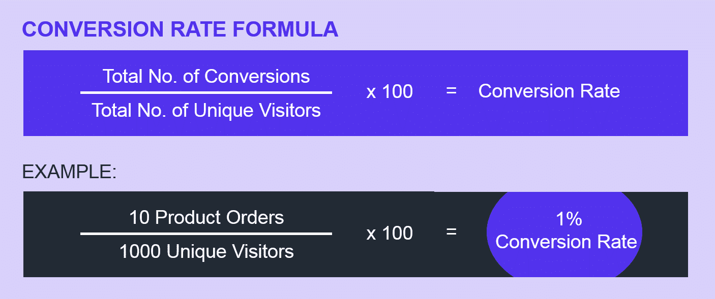
Again, you can replace conversions with any desired actions you want to measure. Most eCommerce analytics tools like Google Analytics can easily provide you with your desired conversion rates. For WooCommerce users, you can conveniently integrate it using available Google Analytics plugins such as WooCommerce Google Analytics.
With Google Analytics, you can dig deep into your historical data to find out why your product page is ineffective and understand the areas that need improvements.
Let’s say your data tells you that your monthly visitors are up by 10% but product purchases are down by 50%. This tells you that there’s something wrong. It could be that you’re attracting the wrong customers or they’re not persuaded by from your product page.
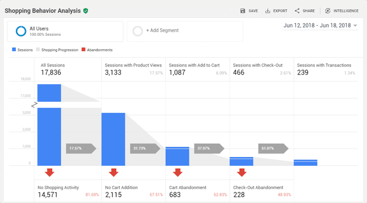
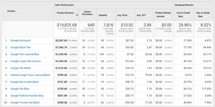
To help you evaluate your conversion performance, check out these various eCommerce conversion metrics in Google Analytics. Note: you will need to turn on Enhanced Ecommerce to see the following reports.
Shopping Behavior Analysis – helps you analyze the number of sessions that included in each stage of your sales funnel. How many sessions continued from one step to the next, and how many abandoned the funnel at each sales stage.
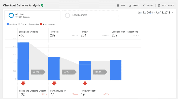
Checkout Behavior Analysis – helps you visualize the number of users who successfully moved through your checkout process.
Product Performance – helps you see how your products performed in terms of revenue, price, quantity, and user engagement.
What is a Good Conversion Rate?
You should bear in mind that a good conversion rate varies depending on the industry you are in and the niche you are serving to. But, if you are looking for baseline goals, here are Q1 2018 global benchmarks that you should try to keep up with:
- Product Conversion Rate: 2.59%
- Add-to-Cart Rate: 9.89%
You should also watch out for the following areas because they will give you insights as to what specific area you’re losing your customers:
- Cart Abandonment Rate (target below 75.6%): when a shopper puts items in their cart, then leaves the site.
- Checkout Abandonment Rate (target below 46%): when a shopper has already started the checkout process, then leaves.
- Bounce Rate: when a visitor leaves after viewing a single page.
- Exit Rate: when a visitor leaves after visiting more than one web page on your site. The rate should be below
However, good is relative.
There are also other various aspects to consider, such as traffic sources, target market, location, and a lot more before you can say you have a good conversion rate.
The most realistic answer to that question is: a good conversion rate is better than what you had last month. (Source: ConversionXL)
7 Ways to Boost your Product Page Conversion
Here’s a rundown of the best practices for producing a highly converting product page.
1. Make it Easy to Find the Right Products
The moment a shopper visits your online store and views a product page, the time is already ticking. If it takes too much time and effort for shoppers to find what they are looking for, the higher the chances that they won’t convert.
Making things easier and simpler will influence your shoppers to purchase immediately. And you can do this by ensuring you have the following features:
- Improve onsite search: add live search, filters, indexing and more with Algolia. You can also speed up search with Elasticsearch.
- Improve navigation on your website: A layered product navigation makes it easy to find a product based on category, price range, color, size or any other available product attribute. You can implement this using Ajax-Enabled Enhanced Layered Navigation.
- Implement product comparison: A part of a customer’s purchasing decision process is comparing products. They want to compare the features, benefits, and prices to know what product is right for them. Try Product Compare to make this easier.
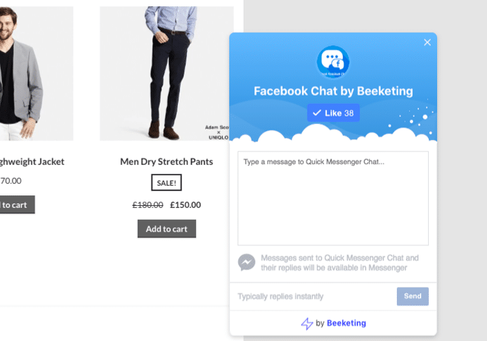
- Enable Messenger live chat to proactively extend help to shoppers browsing or display a chat window so they can reach out to you. You can easily do this with the Beeketing for WooCommerce plugin.
2. Use High-Quality Product Images
People are highly visual. The product image is the holy grail for any product page. Because of the absence of any physical contact, an online shop relies heavily on product images as a point of reference for online shoppers. Product images can answer some questions that a shopper has without scanning a lengthy product description.
Here are some simple tips to improve your product images and your overall visual content strategy:
- High-resolution is a must: Shoppers who have been presented with high-quality product images are three times more likely to convert than those who have not. From a shoppers’ perception, low-resolution images prevent them from examining the product further and makes your company seem amateurish and untrustworthy.
- Zoom Feature: Using a zoom feature that allows interactive zoom or pan on product images is a favorite among shoppers. In fact, 38% of online shoppers are more likely to purchase a product from an online store with a product zoom feature.
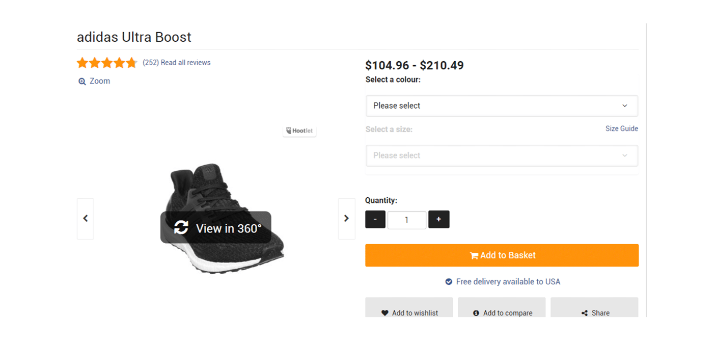
- 360° Product View: The use of a 360-degree product view allows you to display different dimensions, angles, and perspectives of the product. Online stores have seen a 6% lift in sales for the products that showcased 360° images over those with static images.
For example, Wiggle.co.uk combines 360-degree and zoom features on their product pages to allow shoppers the ability to zoom, rotate and change viewing angle of the product.
3. Cut the Jargon in Your Content
Words are powerful. You should accompany your product page with quality content to drive your customers to be more likely to purchase. Make your content easier to mentally process and try to write in a manner that your target audience would resonate with. Be as authentic as possible with your style of writing like how you would normally talk to your friends.
Remember you don’t just provide information with your content, you also tell who you are and it’s a way to persuade shoppers into buying. In fact, quality descriptions can potentially increase conversion rates by 78%.
Do not try to wow people with fancy, complicated business language – it just doesn’t work.
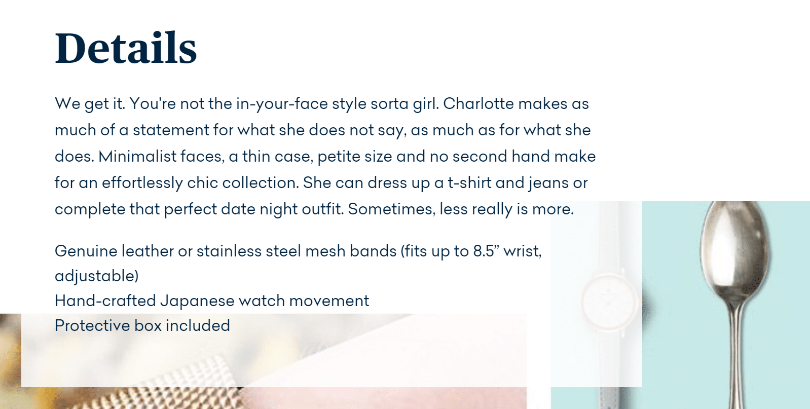
You write for people – it’s people who read your site and who will decide to buy based on your words. Invest in writing your product descriptions so that they sound positive and friendly to indicate that you are an open and engaging brand.
See how Wristology writes beautiful and charming product descriptions as if you’re talking to a friend.
4. Run Promotions to Increase Urgency
According to sales guru Zig Ziglar, there are only 4 reasons why people aren’t buying from you:
- No Need
- No Money
- No Trust
- Not in a Hurry
While you can’t do much about the first two reasons, you can definitely influence urgency and build trust. Let’s first talk about creating urgency and then discuss trust later on.
You can increase urgency on your product page by triggering the law of supply and demand. There are 2 kinds of scarcity you can create:
- Quantity-related scarcity (Only 2 items left at this price)
- Time-related scarcity (Last hours to buy)
If the supply of your product is endless, you can give out time-sensitive bonuses, a free gift to the first X amount of buyers or a discount if they complete the purchase within a certain time frame.
For example, this online store puts urgency triggers on your offers by adding a countdown timer using the Beeketing for WooCommerce plugin. Offers with a countdown timer will tell shoppers that if they want to take advantage of the deal, then they have to act quickly.
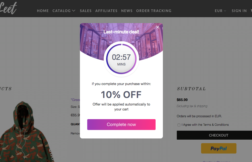
Tip: The reason for scarcity should be authentic. Do not lie to your shoppers, ever. If it’s fake scarcity, your customers are smart enough to recognize, and your trustworthiness plummets.
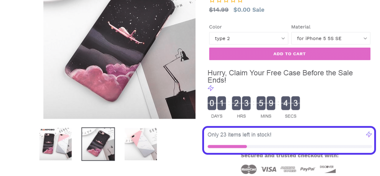
You can also create messages that tell shoppers that the supply for a product is limited or inventory is already low so it may not be available soon. Use messages like ‘Only 3 left in stock’ or ‘The deal expires in 2 hours’’. Here’s how it might look.
5. Build Trust
Now, let’s talk about trust. Trust is an essential ingredient to a successful conversion. But why is it important for customers to trust an online store before making a purchase? Well, because online transactions include personal information like name, home address and credit card details. Plus, there’s money involved.
You can easily build your website’s credibility by putting visible trust signs on your homepage or on the product page. In fact, the second biggest factor for online shoppers to trust an unknown website is by putting trust signs like McAfee.
Also, provide reassurance to your visitors by showing honest testimonials and reviews from your satisfied customers. 74% of customers said that positive reviews make them trust a business more.
You can also add credibility by displaying social proof like a popup message saying that other people are looking at an item or that there’s a recent purchase for that product, just like this.

6. Rescue Lost Conversions
Did you know that a whopping 98% of visitors won’t purchase from you on their first visit? Ya, it’s really that high. This is a challenging issue for many online stores, especially because traffic is incredibly hard to obtain. Imagine those possibly lost conversions.
But there are many ways for you to still rescue those seemingly lost opportunities. Here are some examples:
- Set up wishlist feature: Sometimes shoppers just aren’t ready to buy yet. It’s important that you provide wishlist buttons on your product page for them to be able to save a product, come back to it later, and then complete the purchase. With a wish list feature, no potential conversion will go to waste.
- Retarget customers with abandonment emails: You can also gently remind your shoppers about their abandoned carts by sending cart abandonment emails. You can conveniently set up automated emails to recover abandoned carts using the built-in feature in WooCommerce or automate the job via the Mailbot app in the Beeketing for WooCommerce plugin
7. Compare Yourself With the Competition Before Shoppers Do
Every product and service has its competitors – direct and indirect. Research shows that people do comparison shopping all the time. Before making a purchase, they visit three websites first to find the best product.
Bringing that into action, use it to your advantage – compare your products to others before shoppers do.
People usually only look at the most important things like price and product features. And since you are in control, you can manage the conversation. Say, for example, your product is more expensive than your competitors, then what you can do is to put your advantages as the most noticeable part of your comparison table.
This way you’re explaining why buying your more expensive product is more beneficial than buying the competitor’s cheaper alternative.
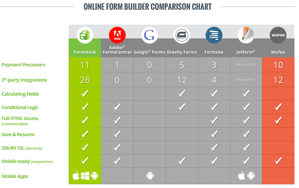
Having a product comparison table can help prevent your visitors from leaving your website. Again, since you are in charge of the communication, you can display your product as the best choice, just like how Formstack compares its product versus other form builder services.
Summary
By optimizing your product pages, you are boosting what your product page is expected to do: convert. There are many ways to boost your product page conversion rate, but the main idea is to create a positive shopping experience.
You can achieve this by making sure that your customers can easily search for the right products, visually check the product with a quality photo, understand your content, fend off mistrust, and complete a purchase seamlessly.
Categories
Subscribe Now
10,000 successful online businessmen like to have our content directly delivered to their inbox. Subscribe to our newsletter!Archive Calendar
| Sat | Sun | Mon | Tue | Wed | Thu | Fri |
|---|---|---|---|---|---|---|
| 1 | 2 | 3 | ||||
| 4 | 5 | 6 | 7 | 8 | 9 | 10 |
| 11 | 12 | 13 | 14 | 15 | 16 | 17 |
| 18 | 19 | 20 | 21 | 22 | 23 | 24 |
| 25 | 26 | 27 | 28 | 29 | 30 | |
Recent Articles
-

Posted on : Jul 25
-

Posted on : Jul 07
-

Posted on : Apr 07
-

Posted on : Mar 19
Optimized my.cnf configuration for MySQL 8 (on cPanel/WHM servers)
Tags
- layer 7
- tweak
- kill
- process
- sql
- Knowledge
- vpn
- seo vpn
- wireguard
- webmail
- ddos mitigation
- attack
- ddos
- DMARC
- server load
- Development
- nginx
- php-fpm
- cheap vpn
- Hosting Security
- xampp
- Plesk
- cpulimit
- VPS Hosting
- smtp
- smtp relay
- exim
- Comparison
- cpu
- WHM
- mariadb
- encryption
- sysstat
- optimize
- Link Building
- apache
- centos
- Small Business
- VPS
- Error
- SSD Hosting
- Networking
- optimization
- DNS
- mysql
- ubuntu
- Linux


